Being the backpacker that I am, I am always in the look out for great travel deals specially for air fares. So for today, I will be scrutinizing a fare comparison site. We will be taking a look on how easy does it make a traveler’s life is, presenting Momondo.com.
First off lets take a look at the values that of how Momondo was built upon.
I like the way how Momondo is presented to its target audience, travelers. It does not show it self as just another site that would simply give you the rates available but with a total travel experience in mind. True enough when I dug further what they aspire to deliver is to inspire travel and not just mere generate profit from searches and I must say that you can really feel that it was built with the traveler in mind with the over all feel of the site.
The Experience
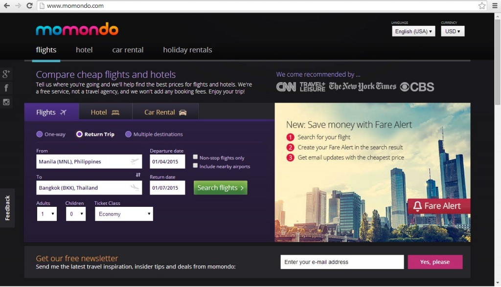
The first thing that I look for in website is its ease of use. I have this rule that I should not click more than three times on to another page to get what I need. Did Momondo.com passed this? Well it’s an astounding YES! It only takes one click from its home page to get the results!
Its straight forward layout takes you to what you need right at its home page. Its uncluttered landing page makes it instinctive for the user to navigate the pages. You actually don’t need to think what to do you’ll just do it when you see it.
The page is also not that heavy so it loads easily so if you have a broad band connection like mine you won’t get frustrated just waiting for it to completely load. Since it loads fast you’ll be able to enjoy the fast suggestive auto populating fields for information like airports that you’d like to go to.
It is also good that the site enables you to customize the settings such as the currency and language because just like me I want to see the rates with my local currency allowing me to understand the real value of the fares.
The Real Deal
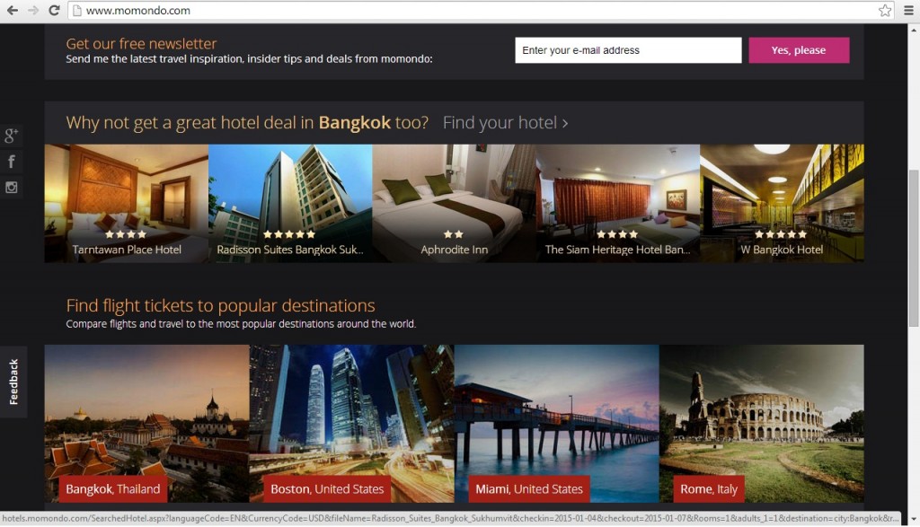
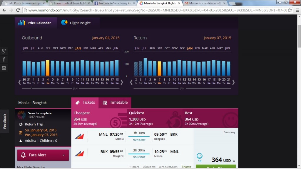
Beyond the nice layout let’s take a look at what matters most of them, The results! Comparing from other from other fare comparison sites, Momondo.com offers comprehensive and competitive results. It allows the user to possibly source their travel needs in just one stop with its car rental, hotel and even holiday rental options.
Room To Improve
Hmmm…. truth is I cant find anything yet(I’ve used the site for several days now) maybe because they developed the site with simplicity in mind providing the users what it really needs.
The Extra Mile
I am always bound to day dream about destinations anytime and anywhere! So it is really important for me to have access to travel resources and yes to put a stop to my obsessive compulsive habit of just fiddling through information and creating an itinerary up in my head.
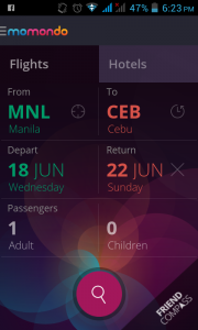
There are two ways that you can access momondo.com on the go, if you can easily access it through any mobile browser by going to momondo.com and you’ll be automatically directed to their mobile site.
The second option is the one that I recommend, download their free app through the android play store. I
like this option better because it simply lets me tap on the app icon and vioala! The information that you need is there at your finger tips and you can access it by tapping it anytime you fancy!
Over all I will give Momondo.com 4.5 stars out of five… almost perfect? Well yes, I like the usability and how it delivers to its target market, of course being competitive is out of the question as it is a requirement for any service driven site and if it failed on competitiveness I would have given it a 1 star. So yep! start tapping your phones and downloading the Momondo.com app!


